Thursday, February 13, 2014

Montage: Activity 4


Find two examples of photomontages that are either from a commercial source or from a fine art background. Discuss in what context they have been produced and what techniques they share with political photomontages.
What messages, if any, are communicated through these photomontages and how effective do you think they are? Consider different ways that each image could have been tackled by the artist and come up with an idea for ‘another in the series’.

Thomas Barbey

Untitled, 1982 Jerry Uelsmann
           The context in which these photomontages have been created are not exactly illustrated but it is clear that both images were created by someone who possesses a fine art background. The seamless merging of these photomontages implies that the artists knew what they were doing and knew how to manipulate their resources to their benefit. Just as political photomontages have a subtle (or not so subtle) message these montages do as well. The first has a sense of perspective and the incorporation of everyday objects with those who are not so common, combining a daring feat such as skiing or snowboarding with a commonplace table and tablecloth. The second conveys the message of roots and creating a steady foundation upon which a home and family will be built. It is a perfect illustration of the phrase "home is where your roots are". Not exactly worded like that but most people know what the basic point is.
           It would be relatively easy for the artists to continue on to make a series from these photomontages. Based upon the effective conveyance of the messages in their first montages this would be an easy task. Barbey could likely create another image in which athletes were performing on an everyday surface/environment and Uelsmann could further combine more earthly elements with human-made objects. Barbey stitched together an image of a ski slope and a tablecloth to make it appear as if the skiiers were going down a tablecloth - it makes them look small in comparison to their surroundings and Uelsmann bonded a tree's roots with an old, two-story home, both of which required critical thinking and trial-and-error approaches. It is likely that they both had a dominant theme for which they were trying to accomplish.


Monday, February 10, 2014

Montage: Activity 3


As editors exercise their ever-increasing power over information control, what limits would you impose on them as to the extent to which they can manipulate the photographic image? Devise a series of guidelines that will control the release of images that have been constructed for media use so that the public is aware as to the extent of the manipulation.

Jennifer Lawrence,  huffingtonpost.uk

My guidelines would be as follows:
  • No editing to alter body shape or size.
  • No creating skinnier arms or legs, or smoothing out wrinkles or curves - they are natural.
  • Only make up products can be used to enhance a model's features - no post-processing editing of skin, etc. unless witnessed consent is provided by the model.
  • Merging pictures for a commercial use should not be allowed.
    • Photomontages should be allowed artistically or for political use only if there is a disclosure that states the image has been tampered with.
  • Using another person's work and making small changes should not be allowed unless permission by the original artist is given.
  • On some page in the published magazine, book, article, etc. there should be a side-by-side comparison of the edited image and the original (just as the one above).
  • The basic integrity of the picture should be preserved.


Tuesday, February 4, 2014

Montage: Activity 2

Find two examples of political photomontages that are either from a historical or contemporary source. 
Discuss in what context they have been produced and how effective you think they communicate their intended message. 
Discuss the techniques that have been used to assemble the examples you have chosen and offer alternative ways that the artist could have put over the same message.


Museum Ludwig: Marenus, Drahtseilakt, Paris 1940
           This image was created in 1940, in the midst of the second world war. We see balancing on a tightrope Hitler and two of his followers, one on the other's back. This balancing act that is portrayed most likely symbolizes the tedious and comical attempt at world domination or at least world control by these dictators, which is a very easy message to understand; their walking on a tightrope shows tediousness with what they are doing and the expressions on their faces and positioning of their bodies adds to the effect. In addition to the tightrope, the bed of swords underneath them most likely represents their opponents and the consequences of their success and their failure. Marenus composed this picture by taking separate images of each man and layering them on top of one another, then used an image of a man on a tightrope to get the rope (he eliminated the man/woman) and then he took another image of swords or bayonets being raised in the air. It is likely that he also had a separate image for the barbell/balancing stick the bottom Nazi is holding. Using a similar concept, Marenus could have used another element from the circus such as a unicycle to convey the same message.


Defended to Death, Peter Kennard
           This image was produced during the Cold War, a war in which the Soviet Union and the United States had a suspenseful yet uneventful nuclear scare. Here we see an old-fashioned gas mask secured on Earth which acts as the face of a man, one eye with the American flag and the other with the Soviet/Communist flag (symbolizing the two enemies), and the mouthpiece of the mask being stuffed with nuclear missiles. Pretty straightforward. A composition of approximately five images (the globe, the mask, each flag, and missiles) Kennard used techniques such as layering to place each image in the appropriate place to convey the desired message, which is the toxicity of the Cold War and the hazards it would incur or was incurring already. I cannot think of an alternative means to clearly convey the same message.


Thursday, January 30, 2014

Montage: Activity 1

Briefly discuss why you think painters of the Victorian period might have criticized these early photo montages and why the pictures were popular with the general public. (This technique of piecing together separate images to create one picture is again very popular with both artists and the media). 
What two reasons can you think of for this revival of an old technique?

robinson-photomontage-fading-away.jpg
Fading Away by Henry Peach-Robinson

lonesome_city_dweller_by_herbert_bayer.jpg
Lonesome City Dweller by Herbert Bayer

           Painters of the Victorian period would have criticized these photo montages because they were more crafted than they were one photograph. It is likely that the painters felt attacked in that the photographers could capture life's moments and then combine them where the painters had to hand craft these moments themselves; the photographers were able to use their resources to create a unique and lifelike advantage that the painters did not possess.

           The general public likely enjoyed these pictures for those exact reasons. The montages consisted of multiple pictures which allowed the public to connect with the images - it also added a level of fright (second image above) and one of wonder and gloom (first image above). Art that can be connected with is valuable and this is what the photo montages created.

           I relate the revival of this technique to the cycling of fashion trends. High-waisted jeans and shorts were the trend in the 80's, went out of style for a decade or two, and they are now a trend today. Flannel shirts, floral prints, and pastel colors are other instances of this cycling. So, just as clothing cycles through its trends, photographic techniques do so as well. The other reason this technique may have been revived is that artists are feeling a stronger and stronger need to communicate important messages and moods to their audiences. With people being conditioned to pay attention to (or to ignore) as many visual stimuli there is an emerging need to create something that will stop people in their tracks and to make them truly think about what it is they are seeing.


Monday, January 27, 2014

Self-Image: Activity 3

Consider some of the social pressures that you think may shape your behavior and personal image. List the images most commonly associated with the categories or ‘boxes’ you have already listed in Activity 1.

How have you responded to social pressures to conform by adopting an appearance that relates to the categories that you feel you have placed in or have chosen?


            Because I am a teen I am expected to be crazy but mature at the same time, to have self-control and to have no knowledge of my limits. Social pressures like these have shaped both my behavior and personal image in that I -- now naturally -- always carry myself with high regards and with the air of an adult (most of the time). I have learned how to socialize cordially with adults and have educated myself enough to know my limits in nearly every aspect of my daily life, be it my limits with lacrosse or with those of food and drink. Another pressure of being a teenage girl, almost an adult, is that of dressing cutely. I am not fond of this when it is expected of me all the time. While most days I do my hair nicely, wear makeup every day, and dress well in jeans and clean Vans or dark boots with a variety of matching tops I would rather be wearing a comfortable hoodie and some sweat pants with my hair thrown up, and reading a book while having some tea. Not typical of the average teen but a favorite activity nonetheless.
Jessica Alba from fallwear.com


wordpress.com

Friday, January 17, 2014

Self-Image: Activity 2

Find images in the media, which have been used to represent attractive and unattractive aspects of the human face. Examine and record carefully the photographic techniques used to accentuate both these qualities, drawing up a list that relates to the images you have found. List the physical characteristics that we have come to admire in both the male and female face and write 100 words in response to the following questions.

   
Cara Delevingne from JustLuxe.com
Attractive: Cara Delevingne was 2012's model of the year, she is a Victoria's Secret model and is considered extremely attractive by millions of people. This picture was taken in a studio and the photographer used many techniques to highlight her facial features and make them stand out more than usual. They used direct lighting to eliminate useless shadows and also used a solid white background to contrast with her hair, skin tone, and clothing but also to allow her to slowly blend into the background near the edges. This image allows us to admire her eyebrows, lips, cheekbones, and silky skin (which is also done for men).


Image found on the Montana Meth Project's website

Unattractive: This billboard is an anti-meth campaign by the state of Montana. The boy in this picture has sores and scabs on his face, sunken-in cheeks, and extremely heavy bags under his eyes. One look tells us that this is not a desirable appearance for any typical person. Most likely, the photographer used make make-up to create the image of a meth-head, they used harder lighting on the sides of his face to accentuate his cheekbones and the bags under his eyes, and they used a solid black background to make his face the focal point of the image.


Do you believe that media images or public opinion are responsible for the characteristics of beauty becoming universal stereotypes? 

           Absolutely. Magazines, commercials, advertisements, and movie posters are all edited and manipulated to create the "perfect image" or to make someone more attractive than they actually are. Women are expected to be extremely thin and men are expected to be muscular and chiseled while also being well-kept/trimmed. While most people should take care of themselves, the media's insults of those who do not fit their ludicrous standards has gone too far. Across the globe the idea that a person's weight corresponds directly to their wealth (the fatter you are, the richer you are) has become the opposite.


Do you believe people admiring media images of glamorous models can do any harm?

           I do indeed. These models serve as the models for which society has learned to aspire to be. They desire the size and appearance of these models and many go to great lengths to achieve that ideal image. Some people develop eating disorders or feel it's necessary to count every calorie that goes into their body while some people take this ideal and use it to their advantage by exercising better eating habits and better physical habits as well. So I guess the harm in this is entirely dependent on the individual.


Monday, January 13, 2014

Self-Image: Activity 1

What follows is a list of characters that serve to define and divide us. Make a personal list of the categories you belong to or have a conflict with and visual symbols that are associated with each. Aspirations and expectations should also be listed.

Age/ Generation - Dictates levels of independence afforded to the individual.


           Being a seventeen year old is a large inhibitor of the way people treat and view me. I was born in 1996 and so I am considered a member of a generation that cares more about alcohol than politics and one that disregards education entirely. This is, however, the opposite in my case. I am not quite an adult but I am no longer a child which places me in an interesting situation - living with my parent and also working and being independent of them. A half-and-half sort of thing. Older people disregard my opinions because of my age but those that get to know me and actually take the time to listen to what I have to say always appear to respect my thoughts and opinions; they realize that I am self-aware and also aware of the ever-changing world around me.


Gender - Our gender affects the way we are treated by some individuals.


           I am a female. In most situations I am regarded as weak and incapable of doing "manly" things such as being capable of carrying heavy loads, of being able to have authority in the presence of others, of being lesser than males are. This is untrue. I play lacrosse. I am an excellent leader. I am just the same, and in some cases, better than any male I know. But I am always treated as I am lesser and this is absolutely unacceptable to me. Sometimes, however, this isn't always a bad thing.


Race - Prejudice and perceived racial superiority can affect hopes and aspirations.


           I am Caucasian (a.k.a. white) which does not place any overbearing influence of race on my life and on my actions. I am expected to behave normally and to achieve that which I know I can achieve. I know I am not superior to any other race and I do not think that this way of thinking is fair or right and so I do not let it affect my life. I know my race is no barrier.


Religion - Moral codes and ideologies that serve to guide, unite, and divide.


           Religion does not greatly affect my life either. I went through the motions at my Lutheran church (a branch of Christianity), completed Confirmation, and rarely return to the church. I suppose I am indifferent about religion; I respect the religions of others and believe that they may believe whatever they wish to believe but that does not mean that I have to as well. Honestly, I never felt drawn in by any religion. If I stick to my personal morals and values I know I will do good in this world.


Class or Caste - Classification that an individual may never escape from.


           Hmm... One class/caste that I am a part of is that of kids whose parents are divorced. I will always be known as the friend with divorced parents. Nothing new since 5th grade. I know this happened for the better and so it typically is not a burden but there are times where it distracts me from every other task at hand. There are more but I cannot think of them presently.


Personality - Extroverted and introverted are classifications of personality.


           In most instances I am an extrovert. I am not afraid to speak out and to lead people when a leader is necessary. I enjoy speaking and sharing my thoughts, but the introvert within me also recognizes the importance of listening. I often believe that I listen with the intent to understand rather than to respond (this works pretty well I'd say). All in all, however, the environment I am in and the people I am around determine the type of personality I have; I am no more so one than the other.

Intelligence - Educational establishments, based on IQ, often segregate us.


           I am smart. Since this is related to IQ I believe mine is over 130, and this above-average intelligence puts a lot of pressure on my accomplishments. I am expected to produce higher-quality work and to perform at a level well beyond that of many of my peers. Normally this is not an issue. I have been enrolled in numerous honors and Advanced Placement courses and am fully capable of handling the heavier workloads and of doing my work wholeheartedly and completely. I have also been in some regular classes and this is where I under-perform due to boredom - busywork only gets me so far. Because of my placement in these honors courses I am not friends with many of the students who are not in these classes. To be honest, they kind of bother me. They aren't challenged or interested and so they're just a distraction.


Political Persuasion - Left wing or right wing. Each carries its own ideology.


           I typically fall under the side of being a Democrat. I believe in marriage equality and am pro-choice, amongst other things, and that is about all I know about my "persuasion". Generally I think politics is a corrupted system and one that is excruciatingly self-centered. Money this and money that are all that is ever said about the government and that does not help their image whatsoever. Due to this I tend to stay out of any political affairs; life is less stressful that way.


Friday, November 8, 2013

Landscape: Activity 5

Depth

Picture by Megan Arnold

 Using foreground subject matter to create a sense of depth is a crucial element of any good photograph that aims to establish a sense of depth. First off, this image uses a few different subjects to establish that depth. One is the large tree on the left side, followed by the road and the wooden (mini) pillars, and then the large tree on the right. All of these elements carry on through the image and decrease in size as the distance between where I stood and where they stood. The image is likely to be read with a sense of longing and desolation (just the time of year) but also one of curiosity that is fueled by the great distance that is portrayed. If one focuses on the road itself it also conveys a slight sense of motion.

Thursday, November 7, 2013

Landscape: Activity 4

Effects of Closed and Open Landscape Photographs


Closed Landscape

Megan Arnold, Sedona 2013
The closed landscape above is read as a comforting place that has room for "questions" and thoughts as to what is covered by the tree and where the river leads to. In this sense, it has a tinge of mystery and intrigue that many don't realize to begin with. (I didn't allow myself enough processing time in Photoshop to accentuate the colors.. oops) Moreover, it is nothing like the following image...


Open Landscape

Megan Arnold, Sedona 2013
 Open landscape images leave no room for questions or mysterious moods. Taken on a cloudy and somewhat dreary evening, the photograph was hindered slightly but oh well; I still like it. This image looks nothing like the above picture and is read in an entirely different manner. Everything in the frame is clearly seen and there is no area of detail that is left out. The horizon line can be seen clearly and there is detail in every minute area of the frame. In addition, it has less elements of leading lines and other photographic techniques and is mostly "there" to showcase the beautiful landscape of Sedona, Arizona.


Both images taken by myself, Megan Arnold, on November 4, 2013

Landscape: Activity 3

Photographs vs. Paintings

Expressive possibilities, similarities, and means of expression.

"Eiffel Tower" - Cindy Winter

This painting of the Eiffel Tower is open to many expressive possibilities in that the painter can decide which colors they wish to use, which point of view they will paint the tower from, and which details will be included in the painting. Here, Winters made the background contrast with the Tower but the colors chosen also complement the Tower. Winters' means of expression is also complex yet simplified - she excluded most of the Eiffel Tower's structural detail as well as the detail in the trees, which makes for an interesting point of view. The viewer is able to focus on the painting but is not able to focus on the details that they know are present on the tower. Winters' expression with this painting falls along the lines that we can see the tower but, in reality, we cannot see the tower.


"Eiffel Tower from Below" - Fredrik on fredriksadventures.com
This image by Fredrik has a few similarities to the painting above; it is taken from, relatively, the same point of view, the colors and content are similar, and the details of the structure are discernible. Fredrik does not have as many options as to what the atmosphere of the image has, what colors and tone are used, and from which angle the image is taken (to some extent). Expression is also a bit more difficult for the photographer in that he is limited to what is presented before him rather than what he is artistically capable of.


Thursday, October 31, 2013

Landscape: Activity 2

Questioning Social Values


Landscape photographs can convey a vast array of emotions, questions, and even critical social values. The following images pose a few important questions about the reality of today's social values and the clear or ambiguous the photographer's communication is.

Image by Adam Burton  
This image questions the social value of environmental protection and the effects of global warming. Burton clearly captured this message ("communication") and did so in a sort of then-and-now, compare and contrast method. The foreground contains melted and seemingly nonexistent iceberg fragments while, in the background, resides full-force, mountainous glaciers that portray the magnificence of the scene as a whole. A possible interpretation of this is the effects of human pollution and how it is causing the destruction of the natural habitats of the arctic.

Image by Kenneth Tanaka

This image is taken of what used to be a beautiful park, taken one year after a picture of the park was taken. Tanaka was clearly conveying a message with this photograph, and it is one of unncessary destruction of nature for the expansion of society or cities. The message is clear and concise and stirs up a powerful wave of emotions, such as dissapointment, contempt, and possibly anger. These emotions are conveyed by the simplicity and contrast of the image. The leading lines of the bulldozer's trails are uniform, monotone, and bleak while the bulldozer is coloful and unique in comparison. In addition, Tanaka uses the wide depth of field to allow the imagination to fill the frame with what was there before being destroyed.


Tuesday, October 29, 2013

Landscape: Activity 1

Interpreting Photographs

Bethlehem, Graveyard and Steel Mill - Walker Evans 1935 © Walker Evans Archive, 1994,
The Metropolitan Museum of Art
         
           In this image by Walker Evans, there is a graveyard, a steel mill, and a city/ town in the background. A few telephone lines are strewn throughout the image and there is a large, likely stone, cross in the foreground. There are many interpretations of what this image is about but I find it slightly ironic in the sense that the graveyard is in the foreground and the steel mill is in the background; this creates a sense of cause and effect. The pollution from the mill created a hazard to the citizens and, in turn, killed the citizens. (Not good.)

           Walker Evans has been extremely effective in this landscape image to communicate a point of view. I say this because the frame contains multiple aspects of the life and culture in the society and, also, it provides a canvas for the imagination to take over and to interpret the image as the viewer pleases. This is absolutely considered as art because it is intriguing and unique in the aspect that it contains multiple dimensions that allow for guided interpretation.


Monday, October 28, 2013

Time: Activity 5

Solid and Fluid Forms

What do they look like and how are they created? 


These two images above were created by me, the first in Illinois and the second on a trip I took to Washington D.C.. They both contain solid and fluid forms. The first image is of a colorful yard decoration, which is the blurred object, and the building behind it is the solid form. By spinning the decoration slowly the blurred effect was achieved. In the second image the street and the trees are the fluid form and the car mirror is the solid form. This was easily achieved since the car was already in motion.

Time: Activity 4

Slow Shutter Speeds


The subject matter in this picture consists of the silhouetted landscape, the stars, and the mountain in the background. In order to achieve this effect with the stars there are many potential areas for technical difficulties.  One is the necessity for a stable ground to have the camera on, and this is easily fixed by using a tripod. Another is finding the correct shutter speed/exposure time in order to achieve the desired effect of movement in the stars. This is a laborious task, however, and the only remedy is to take multiple test shots and see how they each come out.

The depth of field in this image is large, as the sky, the trees, and the mountain are all in the frame. This adds the effect of making the image look incredibly large while the viewer/audience feels incredibly small.

Adding all of these elements together the photographer achieved the perfect balance of serenity and movement. The cool colors and lack of brightness allow for the stars to remain the focal point of the image and also allow the 'movement' of the stars to be perceived. Since there is a defined point where the star is and a trail that follows each star, it appears that there is a sphere of celestial elements covering the entirety of this picture.

Tuesday, October 22, 2013

Time: Activity 3

Fast Shutter Speeds

For this assignment I was required to capture a running or jumping figure and vary the angle at which the camera was with respect to the figure itself; in this case, I used my neighbor's dogs. Both the visual effect and the difficulties of motion blur will be discussed as well.

Motion blur within these images occurred in the background due to the use of the technique of panning. This allows for the dog to be entirely in focus while the background is blurred. This creates a sense of movement as well as a sense of focus - it is clear what or who the subject of the image.


There are many crucial elements to these four photos and the most important is the focusing technique as well as the shutter speed I used. The focusing technique I used was to switch the camera from auto to manual mode and to follow the dogs as they ran around the yard chasing the thrown toy. I would try to focus most of the image before they began moving but once they did, I panned and refocused as necessary to keep the puppies in focus.

The shutter speeds that I used varied from 1/15 of a second to 1/125 of a second, so for the top two images a faster shutter speed was used (closer to 1/125), and for the bottom left image a slightly slower shutter speed was moved as the puppy was trotting towards me; the image to the bottom right, where they are indoors, was taken using a shutter speed between the previous two.

The visual effect of this photo set is one of speed and agility, as well as fluidity. Each image portrays a different sense of movement and allows for the audience to experience the pace and energy of the moment that is captured. The first two images create a sense of excitement while the last two images create a sense of calm and winding-down.


Monday, October 21, 2013

Time: Activity 2

Fast Shutter Speeds


Image by Stephan Drescher; found on flickr.com

The photographer of this picture used a fast shutter speed to capture the shattering of the light bulb as it fell. When using a fast shutter speed there are many difficulties a photographer must overcome to produce the desired effect, such as not having enough light as well as not having the proper aperture (a wide one, preferably), and also having a high ISO.

The depth of field was affected in this image to be relatively shallow, as all the details and pieces of the bulb must be captured. In addition, this image conveys the feeling of motion because of all the different angles the pieces are going, the different sizes of the pieces, and the different shadings and lightings on each individual piece. Everyone has encountered something falling and shattering and so that experience also aids the photographer in conveying motion in this image.


Friday, October 18, 2013

Time: Activity 1

Henri Cartier-Bresson - The Decisive Moment

Catching the decisive moment has added to the picture's quality because it allows for a sense of reality and the gritty nature of everyday life. Cartier-Bresson's photographs portray a world of actuality and realism that does not idealize any specific aspect of the world. By capturing the decisive moment the quality of Cartier-Bresson's images have been enhanced in a manner uncommon to standard photography that creates an odd sense of calm amidst a scene that is often filled with calamity.

In the first image there is a contrast between the stationary, dismembered vehicle and the traveling, functional locomotive in the background. This contrast creates depth and adds thought to the photograph that would not have been present if it were not present.
Image by Henri Carter-Bresson; found on magnumphotos.com

The second image is where the sense of calamity is portrayed. The crowd is tightly linked and they are all looking towards a common point. This allows for a sense of curiosity on the audience's part and one of mystery that Cartier-Bresson created. In addition, the picture portrays a scene of reality and a rugged truth.
Image by Henri Carter-Bresson; found on magnumphotos.com

Sunday, September 22, 2013

Light: Activity 4

Maximum Depth of Field


    These photos show the technique of Great Depth of Field because the entire photo is in focus from the foreground to the background. The photographer's selective use of aperture affects these pictures in that, by using a smaller aperture, they have enabled their entire picture to be detailed and in focus.
Image found on jaybeestock.com (rocks on lake)
Image found on wordpress.com (picnic table)

Shallow Depth of Field


    These photos show the technique of Shallow Depth of Field because only the subject is in focus and both the foreground and the background are out of focus. The photographer's selective use of aperture affects these pictures in that, by using a larger aperture, they have enabled only their subject to be detailed and focused.
Image found on posterjack.ca (flower)
Image found on 123rf.com (typewriter)

Light: Activity 3

Shot into the Light

staticflickr.com


flickr.com


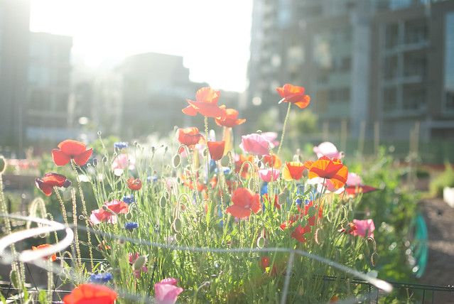
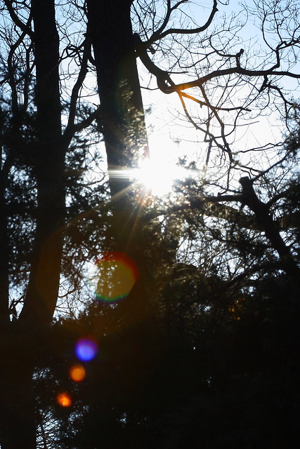
      This image was shot into the light source which, in this case, is the sun. The photographer could have gone about taking a light meter reading for this image by pointing the cone of the light meter towards the light source and the other part of the meter towards the flowers or the tree. Essentially, the photographer needs to hold the meter between the light source and the subject of the image. Then, by pressing the "shutter" button, the photographer would have successfully captured the ISO level, the aperture, and the shutter speed.


Friday, September 13, 2013

Light: Activity 2

Single Light Source

    The use of a single light source in this image allows for the texture and pattern in the guitar to be highlighted and contrasted with the solid black background. By placing the light to the right of the guitar (left since we are facing it) the shadows created by the adjustment knobs and the pick board are deeper and add more depth to the image as a whole.
Image found on mylespaul.com

Multiple Light Sources

    The use of multiple light sources in this image allows for the full frame of the car to be seen. The lights are most likely coming from the ceiling and this allows for every aspect to be illuminated. Having additional light does not degrade or diminish the quality of the image but it does create some distractions by having the panels of the garage door more detailed.
Image by Dan Newton on liquidinplastic.com