Friday, November 8, 2013

Landscape: Activity 5

Depth

Picture by Megan Arnold

 Using foreground subject matter to create a sense of depth is a crucial element of any good photograph that aims to establish a sense of depth. First off, this image uses a few different subjects to establish that depth. One is the large tree on the left side, followed by the road and the wooden (mini) pillars, and then the large tree on the right. All of these elements carry on through the image and decrease in size as the distance between where I stood and where they stood. The image is likely to be read with a sense of longing and desolation (just the time of year) but also one of curiosity that is fueled by the great distance that is portrayed. If one focuses on the road itself it also conveys a slight sense of motion.

Thursday, November 7, 2013

Landscape: Activity 4

Effects of Closed and Open Landscape Photographs


Closed Landscape

Megan Arnold, Sedona 2013
The closed landscape above is read as a comforting place that has room for "questions" and thoughts as to what is covered by the tree and where the river leads to. In this sense, it has a tinge of mystery and intrigue that many don't realize to begin with. (I didn't allow myself enough processing time in Photoshop to accentuate the colors.. oops) Moreover, it is nothing like the following image...


Open Landscape

Megan Arnold, Sedona 2013
 Open landscape images leave no room for questions or mysterious moods. Taken on a cloudy and somewhat dreary evening, the photograph was hindered slightly but oh well; I still like it. This image looks nothing like the above picture and is read in an entirely different manner. Everything in the frame is clearly seen and there is no area of detail that is left out. The horizon line can be seen clearly and there is detail in every minute area of the frame. In addition, it has less elements of leading lines and other photographic techniques and is mostly "there" to showcase the beautiful landscape of Sedona, Arizona.


Both images taken by myself, Megan Arnold, on November 4, 2013

Landscape: Activity 3

Photographs vs. Paintings

Expressive possibilities, similarities, and means of expression.

"Eiffel Tower" - Cindy Winter

This painting of the Eiffel Tower is open to many expressive possibilities in that the painter can decide which colors they wish to use, which point of view they will paint the tower from, and which details will be included in the painting. Here, Winters made the background contrast with the Tower but the colors chosen also complement the Tower. Winters' means of expression is also complex yet simplified - she excluded most of the Eiffel Tower's structural detail as well as the detail in the trees, which makes for an interesting point of view. The viewer is able to focus on the painting but is not able to focus on the details that they know are present on the tower. Winters' expression with this painting falls along the lines that we can see the tower but, in reality, we cannot see the tower.


"Eiffel Tower from Below" - Fredrik on fredriksadventures.com
This image by Fredrik has a few similarities to the painting above; it is taken from, relatively, the same point of view, the colors and content are similar, and the details of the structure are discernible. Fredrik does not have as many options as to what the atmosphere of the image has, what colors and tone are used, and from which angle the image is taken (to some extent). Expression is also a bit more difficult for the photographer in that he is limited to what is presented before him rather than what he is artistically capable of.


Thursday, October 31, 2013

Landscape: Activity 2

Questioning Social Values


Landscape photographs can convey a vast array of emotions, questions, and even critical social values. The following images pose a few important questions about the reality of today's social values and the clear or ambiguous the photographer's communication is.

Image by Adam Burton  
This image questions the social value of environmental protection and the effects of global warming. Burton clearly captured this message ("communication") and did so in a sort of then-and-now, compare and contrast method. The foreground contains melted and seemingly nonexistent iceberg fragments while, in the background, resides full-force, mountainous glaciers that portray the magnificence of the scene as a whole. A possible interpretation of this is the effects of human pollution and how it is causing the destruction of the natural habitats of the arctic.

Image by Kenneth Tanaka

This image is taken of what used to be a beautiful park, taken one year after a picture of the park was taken. Tanaka was clearly conveying a message with this photograph, and it is one of unncessary destruction of nature for the expansion of society or cities. The message is clear and concise and stirs up a powerful wave of emotions, such as dissapointment, contempt, and possibly anger. These emotions are conveyed by the simplicity and contrast of the image. The leading lines of the bulldozer's trails are uniform, monotone, and bleak while the bulldozer is coloful and unique in comparison. In addition, Tanaka uses the wide depth of field to allow the imagination to fill the frame with what was there before being destroyed.


Tuesday, October 29, 2013

Landscape: Activity 1

Interpreting Photographs

Bethlehem, Graveyard and Steel Mill - Walker Evans 1935 © Walker Evans Archive, 1994,
The Metropolitan Museum of Art
         
           In this image by Walker Evans, there is a graveyard, a steel mill, and a city/ town in the background. A few telephone lines are strewn throughout the image and there is a large, likely stone, cross in the foreground. There are many interpretations of what this image is about but I find it slightly ironic in the sense that the graveyard is in the foreground and the steel mill is in the background; this creates a sense of cause and effect. The pollution from the mill created a hazard to the citizens and, in turn, killed the citizens. (Not good.)

           Walker Evans has been extremely effective in this landscape image to communicate a point of view. I say this because the frame contains multiple aspects of the life and culture in the society and, also, it provides a canvas for the imagination to take over and to interpret the image as the viewer pleases. This is absolutely considered as art because it is intriguing and unique in the aspect that it contains multiple dimensions that allow for guided interpretation.


Monday, October 28, 2013

Time: Activity 5

Solid and Fluid Forms

What do they look like and how are they created? 


These two images above were created by me, the first in Illinois and the second on a trip I took to Washington D.C.. They both contain solid and fluid forms. The first image is of a colorful yard decoration, which is the blurred object, and the building behind it is the solid form. By spinning the decoration slowly the blurred effect was achieved. In the second image the street and the trees are the fluid form and the car mirror is the solid form. This was easily achieved since the car was already in motion.

Time: Activity 4

Slow Shutter Speeds


The subject matter in this picture consists of the silhouetted landscape, the stars, and the mountain in the background. In order to achieve this effect with the stars there are many potential areas for technical difficulties.  One is the necessity for a stable ground to have the camera on, and this is easily fixed by using a tripod. Another is finding the correct shutter speed/exposure time in order to achieve the desired effect of movement in the stars. This is a laborious task, however, and the only remedy is to take multiple test shots and see how they each come out.

The depth of field in this image is large, as the sky, the trees, and the mountain are all in the frame. This adds the effect of making the image look incredibly large while the viewer/audience feels incredibly small.

Adding all of these elements together the photographer achieved the perfect balance of serenity and movement. The cool colors and lack of brightness allow for the stars to remain the focal point of the image and also allow the 'movement' of the stars to be perceived. Since there is a defined point where the star is and a trail that follows each star, it appears that there is a sphere of celestial elements covering the entirety of this picture.

Tuesday, October 22, 2013

Time: Activity 3

Fast Shutter Speeds

For this assignment I was required to capture a running or jumping figure and vary the angle at which the camera was with respect to the figure itself; in this case, I used my neighbor's dogs. Both the visual effect and the difficulties of motion blur will be discussed as well.

Motion blur within these images occurred in the background due to the use of the technique of panning. This allows for the dog to be entirely in focus while the background is blurred. This creates a sense of movement as well as a sense of focus - it is clear what or who the subject of the image.


There are many crucial elements to these four photos and the most important is the focusing technique as well as the shutter speed I used. The focusing technique I used was to switch the camera from auto to manual mode and to follow the dogs as they ran around the yard chasing the thrown toy. I would try to focus most of the image before they began moving but once they did, I panned and refocused as necessary to keep the puppies in focus.

The shutter speeds that I used varied from 1/15 of a second to 1/125 of a second, so for the top two images a faster shutter speed was used (closer to 1/125), and for the bottom left image a slightly slower shutter speed was moved as the puppy was trotting towards me; the image to the bottom right, where they are indoors, was taken using a shutter speed between the previous two.

The visual effect of this photo set is one of speed and agility, as well as fluidity. Each image portrays a different sense of movement and allows for the audience to experience the pace and energy of the moment that is captured. The first two images create a sense of excitement while the last two images create a sense of calm and winding-down.


Monday, October 21, 2013

Time: Activity 2

Fast Shutter Speeds


Image by Stephan Drescher; found on flickr.com

The photographer of this picture used a fast shutter speed to capture the shattering of the light bulb as it fell. When using a fast shutter speed there are many difficulties a photographer must overcome to produce the desired effect, such as not having enough light as well as not having the proper aperture (a wide one, preferably), and also having a high ISO.

The depth of field was affected in this image to be relatively shallow, as all the details and pieces of the bulb must be captured. In addition, this image conveys the feeling of motion because of all the different angles the pieces are going, the different sizes of the pieces, and the different shadings and lightings on each individual piece. Everyone has encountered something falling and shattering and so that experience also aids the photographer in conveying motion in this image.


Friday, October 18, 2013

Time: Activity 1

Henri Cartier-Bresson - The Decisive Moment

Catching the decisive moment has added to the picture's quality because it allows for a sense of reality and the gritty nature of everyday life. Cartier-Bresson's photographs portray a world of actuality and realism that does not idealize any specific aspect of the world. By capturing the decisive moment the quality of Cartier-Bresson's images have been enhanced in a manner uncommon to standard photography that creates an odd sense of calm amidst a scene that is often filled with calamity.

In the first image there is a contrast between the stationary, dismembered vehicle and the traveling, functional locomotive in the background. This contrast creates depth and adds thought to the photograph that would not have been present if it were not present.
Image by Henri Carter-Bresson; found on magnumphotos.com

The second image is where the sense of calamity is portrayed. The crowd is tightly linked and they are all looking towards a common point. This allows for a sense of curiosity on the audience's part and one of mystery that Cartier-Bresson created. In addition, the picture portrays a scene of reality and a rugged truth.
Image by Henri Carter-Bresson; found on magnumphotos.com

Sunday, September 22, 2013

Light: Activity 4

Maximum Depth of Field


    These photos show the technique of Great Depth of Field because the entire photo is in focus from the foreground to the background. The photographer's selective use of aperture affects these pictures in that, by using a smaller aperture, they have enabled their entire picture to be detailed and in focus.
Image found on jaybeestock.com (rocks on lake)
Image found on wordpress.com (picnic table)

Shallow Depth of Field


    These photos show the technique of Shallow Depth of Field because only the subject is in focus and both the foreground and the background are out of focus. The photographer's selective use of aperture affects these pictures in that, by using a larger aperture, they have enabled only their subject to be detailed and focused.
Image found on posterjack.ca (flower)
Image found on 123rf.com (typewriter)

Light: Activity 3

Shot into the Light

staticflickr.com


flickr.com


      This image was shot into the light source which, in this case, is the sun. The photographer could have gone about taking a light meter reading for this image by pointing the cone of the light meter towards the light source and the other part of the meter towards the flowers or the tree. Essentially, the photographer needs to hold the meter between the light source and the subject of the image. Then, by pressing the "shutter" button, the photographer would have successfully captured the ISO level, the aperture, and the shutter speed.


Friday, September 13, 2013

Light: Activity 2

Single Light Source

    The use of a single light source in this image allows for the texture and pattern in the guitar to be highlighted and contrasted with the solid black background. By placing the light to the right of the guitar (left since we are facing it) the shadows created by the adjustment knobs and the pick board are deeper and add more depth to the image as a whole.
Image found on mylespaul.com

Multiple Light Sources

    The use of multiple light sources in this image allows for the full frame of the car to be seen. The lights are most likely coming from the ceiling and this allows for every aspect to be illuminated. Having additional light does not degrade or diminish the quality of the image but it does create some distractions by having the panels of the garage door more detailed.
Image by Dan Newton on liquidinplastic.com

Light: Activity 1

Examples of Subjects Lit by Hard Light


   Hard lighting is used in this picture of Christopher Walken and the effects created are that of harshness and reality. The wrinkles in his face are accentuated as is the slight stubble on his upper lip. The raised right side of his lip disrupts the symmetry in his face which creates a rugged atmosphere for the picture.
Image found on wordpress.com
   Hard lighting in this picture is used to accentuate the woman's cheekbones as well as the lines of her leather jacket. It takes on a crisp yet rugged feel and outlines her features with sharp contrast from her face and her jacket. Every line is clean and flowing which guides the eye throughout the image.
Image found on prophotonut.com

Examples of Subjects Lit by Soft Light


 Soft lighting is used in this image to show the silkiness of the baby's skin as well as to create a playful atmosphere. Soft lighting doesn't wash out the background or the hood or blanket on top of the baby's head which allows for clear but not crisp detail.
Image found on softlight.us

 
    Soft lighting is used in this image to crate contrast between the cat and the background. It allows for the cat's eye to be focused and clear while the rest of the cat is either shadowed or blurred which brings the attention to the eye. The image feels almost playful but has an undertone of seriousness.
Image found on hotsoftlight.com

Monday, August 19, 2013

Frame & Composition: Activity 4


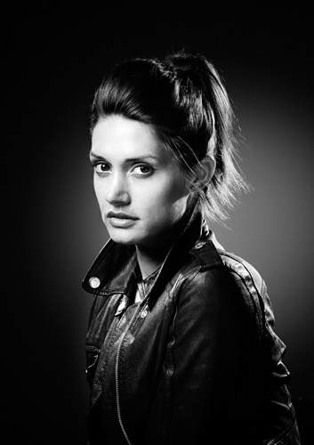
    The photographer who took this picture successfully managed to balance the girl while leaving the image to be off center. The eye flows from the left, down towards the left wheel, curves around to the other wheel, and then curves around to land the final focus on the girl.
The possible intentions of the photographer in creating this image is to create a fluidity within the image while not allowing the girl to be centered in the frame. This imbalance allows the eye to flow through the scene and also notice the other details presented.
Image found on photoinf.com

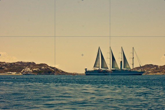
    This image is also off center but it, however, is not balanced in any way. It is difficult to discern which part of the ceiling or wall is the focal point of the image and the clashing point of the two circles distract the eye from the other parts of the image. While the picture is beautiful and crisp, it is unclear what the audience is supposed to focus on.
The possible intentions of this photographer were to showcase the beauty of the architecture as well as the grandeur.

          
     These two images are not balanced. The first is placed too far into the right corner of the frame which creates the need to shift it down towards the center or simply down a bit. The second is centered but is still not quite balanced; the frame either needs to be shifted up or downwards slightly for the image to feel balanced.
Images by Megan Arnold (me).
       
    The two images above are balanced. The first is centered so that it is clearly the focus of the image and doesn't have an entirely plain background. The second is placed off to the bottom left corner of the frame and this creates the space and motion for the eye to wander the piece more than it would otherwise.
Images by Megan Arnold (me).

Frame & Composition: Activity 3

Images that Follow the Rule of Thirds:


The tree exemplefies the Rule of Thirds in that it falls along the rightmost line and the branches also fall along the two rightmost power points. It allows for the eye to focus on the tree and then flows into the background.
Image found on photographymad.com


The ship in this picture is also following the rule of thirds in that it is sailing off the frame and into the distance. It is aligned on the bottom horizontal line and also on the rightmost vertical line.
Image found on 1webdesign.com

Images that Do Not Follow the Rule of Thirds:

This statue is not following the rule of thirds because it is centered, rather than moved off to the left side to allow the picture to have more balance.
Image found on iffies.com

 
The shell is also not following the rule of thirds in that it is centered in the frame as well. If it were to be shifted to either the left or to the right it would have the proper balance this rule requires.
Image by Deirdre Malfatto


Sunday, August 18, 2013

Frame & Composition: Activity 2

"What does John Szarkowski mean when he says that photographers are quoting ‘out of context’ when they make photographic pictures?"

A: When John Szarkowski says photographers are quoting "out of context" when they make photographic pictures he means that the photographers are explicitly deciding what will be seen by their audience once the picture is complete. They are cutting and cropping and formatting their image exactly to their liking and they will thus decide how the image will be perceived by others. Also, they are allowing their audience to, somewhat, decide for themselves how the image will be seen, what is happening, and how they interpret the tone of the image to be.


"The frame often ‘dissects familiar forms’. At the end of the last century photography was having a major impact on Art. Impressionist artists such as Degas were influenced by what they saw. Look at these examples of Degas work, which clearly shows the influence of Photography, and explain why the public might have been shocked to see such paintings."

A: The public might have been shocked to see such paintings because they had never experienced art in a form that was so realistic to that of what they saw with their own eyes. People were growing accustomed to seeing images through photography that enabled light and movement and details to be captured permanently, and now artists such as Degas were developing skills in which they were able to closely imitate photography and the natural perspective of life. They were more realistic and less abstract, less traditional, than art had been previously.

This painting by Edgar Degas is called Waiting c.1882 and is clearly influenced by photography. As Degas practiced photography himself, he was aware of the importance of lighting and of certain features and focal points in a piece of art. Here, Degas balances clarity and confusion as well as the expressions of the two women in the painting. He allows fluidity to be present and this enables the audience to be guided through the piece.

Frame & Composition: Activity 1


This image "fills the frame" by allowing the flower to take up the entirety of the screen. It is the focal point and allows no room for distractions by other objects. Also, it has a superb contrast between the background and the orange of the flower itself; no other object in the background is given room to obtain any attention from the audience.


The lion also fills the frame because its face and mane are in focus and there is no room for distraction from the background. Also, the mane consumes the majority of the frame and it is clear that the lion is the subject of the image.
Image by Jonathan Griffiths